Julia Gruen began working with Keith in 1984 as his studio manager, and is now executive director emeritus of the Keith Haring Foundation.
Though perhaps best known for his fluid, iconic line-drawings of human figures, radiant babies and barking dogs, Haring was fascinated by complex surface pattern and startling color combinations. In this special show for the Web, we take advantage of digital technology to explore some of Haring’s most beautiful works. Online, you can experience, investigate, and enjoy the luminosity of the works, as well as their remarkable detail, at your own leisure.
The works are in chronological order to help you see the changes and developments in Keith’s approach to pattern. Of course, there are many other ways to organize the pieces – by theme, by color, by pattern – all of which are just as valid. Feel free to do so yourself as you click from one work to another. One thing brought home to me many times in my work with Keith is how dangerous it is to generalize about his art. I have learned never to say “never,” or, for that matter, “always.” It may seem clear that as he matured, his imagery became more complex. Nevertheless, he never stopped using his basic, iconic visual language. So while I selected the works you see here precisely for their complexity, Haring was simultaneously producing works with his familiar, direct style, which are featured prominently elsewhere on our websites.
Clearly, Haring sought to startle with his use of color. The juxtaposition of opposing warm and cool colors creates an electricity — or charge — on the surface of the work. But the patterns also engage the eye and stimulate perception. Haring was a product of his own time, so his allusions may be more specifically grounded in the late 20th century: electronic media, computers, TV, movies, drugs, disease, environmental disaster, overpopulation, UFOs, etc. Meanwhile, he was also influenced by many different visual styles and movements. His study of semiotics led to a distillation of his basic visual vocabulary, the development of his “signs.” But the complex works seen here were also influenced by Aztec, Mayan, North African and Aboriginal cultures.

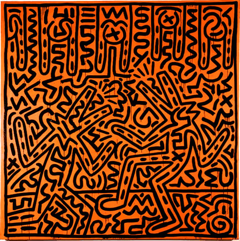
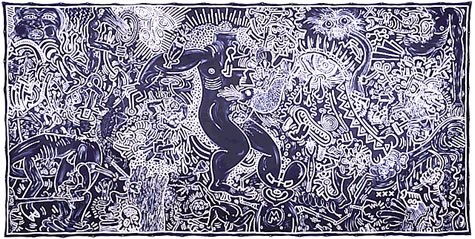
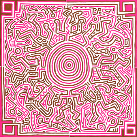
Untitled by Keith Haring and LAII, 1982
acrylic on canvas | 96 x 96 inches | 243.84 x 243.84 cm
Untitled by Keith Haring and Angel Ortiz (LAII). With the inclusion of this work, I want to introduce and emphasize the influence exerted on Haring’s patterned works by the young graffiti writer Angel Ortiz (LA II) . Haring met Ortiz when the latter was only 14 years old. Intrigued and fascinated by Ortiz’s calligraphic tags (LAII, LAROCK, LAROC etc), Haring sought him out and invited him to collaborate on a multitude of projects and works, spanning the years between 1981 – 1985. Ortiz would embellish the negative space surrounding Haring’s iconic symbols, creating a frenetic and dynamic energy, and the resulting collaborations on 2- and 3-dimensional works played a significant role in both of these artists’ careers.

Brazil, 1989
acrylic and enamel on canvas | 72 x 72 inches | 182.88 x 182.88 centimeters
“Brazil”— Keith spent many weeks in Bahia, Brazil, usually during Carnival and was very taken with the diversity and complexity within the country. His good friend and colleague Kenny Scharf married a Brazilian woman, and Keith would visit them annually. Keith was godfather to one of their children, Zena.

Mom, 1989
acrylic on canvas | 60 x 60 inches | 152.4 x 152.4 cm
“Mom”— Who knows what to make of this title?

Monkey Puzzle, 1988
acrylic on canvas | 120 inch diameter | 304.8 centimeter diameter
“Monkey Puzzle”— a play on words: a “monkey puzzle” tree or a puzzle of monkeys.

Moses and the Burning Bush, 1985
acrylic on canvas | 120 x 144 inches | 243.84 x 365.76 cm
“Moses and the Burning Bush”— a purely descriptive title, referring to the Biblical parable.

Piglet Goes Shopping, 1989
acrylic on canvas | 72 x 96 inches | 182.88 x 243.84 cm
“Piglet Goes Shopping”— a private joke between Keith and the original owner of the work. The original owner decorated Keith’s apartment, and the title of the painting refers to the shared experience of shopping for furnishings together.

Silence = Death, 1989
acrylic on canvas | 40 x 40 inches | 101.6 x 101.6 cm
“Silence=Death”— the motto/logo of the AIDS activism group ACT-UP. The group attached the words to the image of the pink triangle on a black ground (the pink triangle was the symbol used by the Nazis to identify homosexuals). Keith appropriated this widely known symbol, and added the overall “veil” of silver figures, which can be clearly seen to “see no evil, hear no evil, speak no evil.”

The Last Rainforest, 1989
acrylic on canvas | 72 x 96 inches | 182.88 x 243.84 cm
“The Last Rainforest”— a narrative depicting the interconnection between all living things, inspired by the perpetual threat to the rainforests of South America.

Walking in the Rain, 1989
enamel and acrylic on canvas | 72 x 96 inches | 182.88 x 243.84 cm
“Walking in the Rain”— a reference to mutations generated by pollution and acid rain.
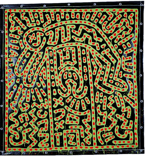
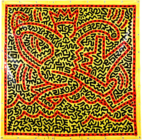
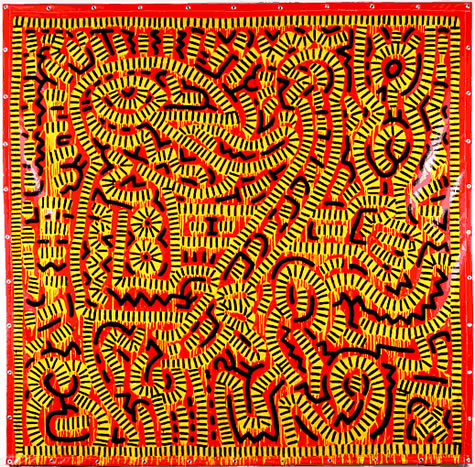
While the titles give us a hint as to the inspiration or anecdote behind the work, far more of Haring’s work is untitled, leaving the viewer “stranded” with his or her own opinions and experiences. This is precisely what Haring preferred — to allow you your own interpretation. Best is to form a link between the artist’s imagination and your own, without any filters at all.
For me, the untitled works I selected for this exhibition all seem to be about eternity, continuity, interconnectedness, contact — all at a frenetic pace. The emotions that accompany this theme are anxiety and euphoria.
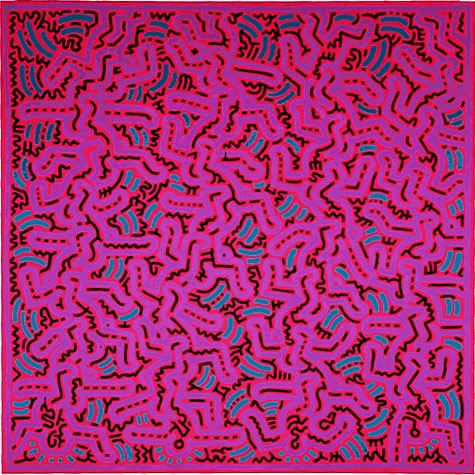
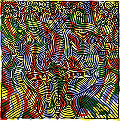
Untitled, 1982
But that’s my interpretation — maybe it’s just about where I’m at right now? The person who created these works certainly experienced his share of anxiety and euphoria, and certainly cared deeply about the connections between living things, but he also cared about the connections between color and line, open and defined space, chaos and clarity. He put all his experience of the world into his art — in the hope that he could communicate at both a visceral and intellectual level with the broadest possible audience.
–Julia Gruen, November 1999
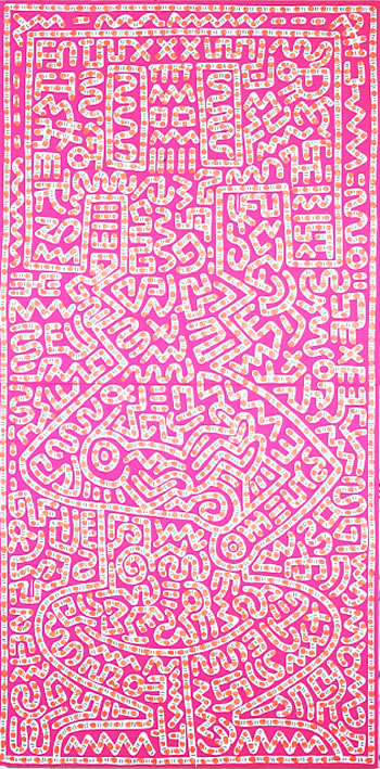
Untitled, 1982
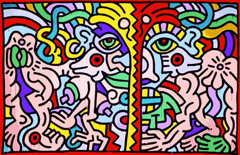
Untitled, 1982
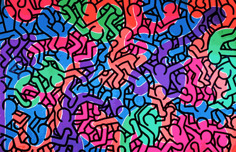
Untitled, 1983

Untitled, 1984
Untitled, 1984
Untitled, 1984
Untitled, 1985
Untitled, 1985
Untitled, 1986
Untitled, 1986
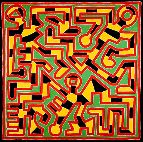
Untitled, 1988
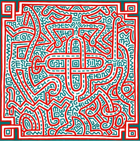
Untitled, 1989
Untitled, 1989

Untitled, 1989