Simplifying painting, to the point of turning it into a synthesis of line and color on the one hand and pure concept on the other, has been the aim of a great deal of modern and contemporary art. In this sense, Cezanne and Duchamp in one way, Matisse and Derain in another, gave rise to a trend in art that has been followed by subsequent generations. Picasso, whose genius has hovered over the art scene ever since his invention of cubism in 1914, is a different story. In fact, he represents the moment of reconciliation between these two preoccupations, which obsessed the most committed artists of the last century.
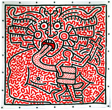
Untitled, 1985, Enamel and dayglo on metal
72 x 1 1/2 x 90 1/2 inches
The ideas of Duchamp, who demanded that painting be placed at the service of the mental sphere, and a certain hedonism of color clearly derived from Matisse are the two main currents that have traversed the whole of modern and contemporary art. These different conceptions of art have moved even farther apart over the course of the decades: the divergence between painting based on line and flat tints and the more manifestly mental forms of linguistic analysis led, in the fifties, to the marked contrast between abstraction and figuration, and, in the sixties, to the differentiation between pop, minimal, and conceptual art. The former is a form of realism loaded with recognizable colors and images, while the other two, almost always an iconic, reflect dispassionately on language and its modalities. Finding a common ground between these different approaches to art seemed an impossible task at the time.
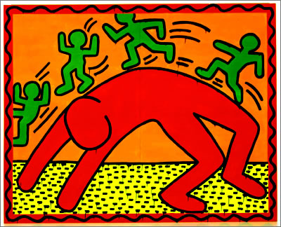
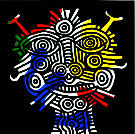
Untitled, 1986, Oil and Acrylic on Canvas
96 x 192 inches | 243.8 x 487.7 cm
Keith Haring began showing his work in the eighties, during the years when young artists were rebelling against the formalistic theories put forward by Clement Greenberg in the fifties, based on the rejection of abstraction in favor of figuration, and which had constituted a legacy for the following generations. Keith Haring, like other artists of those years, saw formalism as a refusal of diversity, and the simultaneous presence of different languages as a cultural and moral asset. His influences, the artists he most appreciated, were Henri Matisse, Fernand Legér, Pablo Picasso, Jackson Pollock, Pierre Alechinsky, Jean Dubuffet, Clyfford Still, Mark Tobey, Stuart Davis, Roy Lichtenstein, and Andy Warhol.
Haring did not hesitate to redo other people’s pictures, repainting, formally and explicitly, works by Picasso, Legér, or Matisse, in demonstration of the fact that tradition is a life blood for artists of every age. Haring believed that the history of humanity is made up of ideas that generate others in turn as they take shape. He was convinced that the way to make contact with art was through an idea and a recognition of its effects; for Haring, an idea was also form. He endorsed Isaac Newton’s statement: “If I have seen farther, it is by standing on the shoulders of giants.” One of the tallest of the giants on whose shoulders Haring set his feet was Matisse, who inspired his combinations of flat tints of color and his decomposition of planes-characteristics that his work shared with Warhol‘s painting, also influenced by Matisse. It was by getting his art to interact with that of Matisse and Warhol that Haring was able to paint by drawing and to draw by painting. Over time this would lead him to attach more importance to form than to color, but with out allowing the latter to be overshadowed by the drawing. This should come as no surprise: form is the sum of several components, of which one is color.

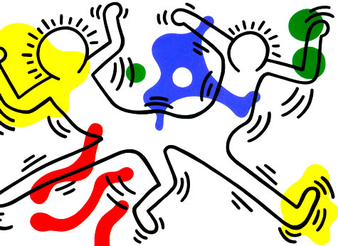
Untitled, 1989, Gouache, Ink, and Photograph on Paper
Created by Keith Haring and Herb Ritts
Matisse described the genesis of his painting in flat tints as follows: “My dominant colors, meant to be deepened and given value by the contrasts, were in fact swallowed up by the contrasts, to which I gave as much weight as to the dominants. This led me to paint using flat slab of color; this was fauvism.”1 Above all, he believed that color should be considered a transcendental derivation of drawing, which he held in equally high esteem. He even included black, previously used only to trace outlines, among the colors. As for space and depth, Matisse went on to say it is the task of the imagination to recognize them in order to reconstruct them.
All this can be found in both Warhol and Haring, but the characteristics of their styles are different because, as Haring himself put it, there is never any repetition in art: “If there is any repetition it is not identical repetition because (at least) time has passed and therefore there is an element of change… everything is always differenf.”2
Untitled, 1983, Acrylic on Tarp | 73 x 73 inches | 185.5 x 185.5 cm
The relationship with the art of preceding generations is always a complicated one. We know that drawing on a single source is never productive for an artist, as it entails the risk of becoming an epigone. If on the other hand the work is a melting pot in which different impulses are allowed to interact, thus giving rise to something that is totally new and therefore personal, the artist will have developed a distinctive style of his own. This is the reason why Haring’s sources of inspiration are not apparent in his paintings, even though he did not deny them, as his journals demonstrate. But the fact that he constructed each work by instinct, that he executed them at a sitting, in the same spirit as Pollock applied to his drippings, shows that Haring had absorbed and digested not the work of a few individual artists, but the complexity of the whole range. From Picasso he took a delight in painting that found expression in the most complete liberty of form; from Legér, the clean black line that shapes his figures, set against the background of Matisse‘s flat slabs of color, but dramatized by the structure of the picture and by the tonalities and juxtapositions; from Alechinsky, the psychic automatism that determined the rapidity of his line in black and white, putting it in sequence like in a comic strip; from Dubuffet, the capacity to capture images in the pure state, filtered by an unconscious understanding in keeping, once again, with the psychic automatism typical of the surrealists; from Pollock and the abstract expressionists in general, both the generative component of chance and the dripping and all those little accidents encountered in the realization of a painting. In this connection, Haring quotes Louis Pasteur: “Chance favors the prepared mind.”3 So chance and design coexist in his work, as do Pollock’s dripping, Dubuffet’s archaic line, and Stella and Judd’s geometric rigor. It was the latter’s vertical structures that gave him the idea of creating totems made of ancient symbols that allude conceptually to Dubuffet, whose faces are logos, the equivalent of Haring’s babies. He admired Still-calling him a “powerful artist”-for his ability to produce pictures that were always different even though the elements that contributed to defining the painted surface are always the same. And he admired Stuart Davis, another follower of Matisse, for the way in which the black lines are superimposed on the areas of color distributed on the canvas. Above all, however, he took on board the experience of pop, of Warhol, an influence we have already discussed, and Lichtenstein, whose large-scale blowups of images from cartoon strips showed that it is not the importance of the subject that makes a work of art great, but the way in which it is represented.

Red, Yellow, and Blue, 1987, Acrylic on Canvas
72 x 72 inches | 182.9 x 182.9 cm
Thus the simultaneous presence of different styles within a new individual entity constitutes a human as well as a cultural value: “Everyone is an individual:’ he wrote, “and everyone is important in that they cannot be replaced… there is nobody in the world who can be put into a group with me and called a movement. My movement consists of only one person. There are several people whose work has similarities to certain aspects or features of what I am doing, but nobody has all of them.”4
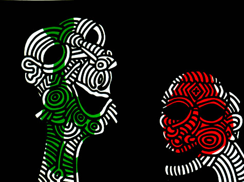
Untitled, 1986, Oil and Acrylic on Canvas
24 x 36 inches | 61 x 91.4 cm
Haring’s art is linked to the aspirations of pop culture. These connections can be discerned in the fact that he devoted his attention to the rift that existed between popular culture and “highbrow” culture, and in his use of bright colors and grounds in flat tints. This feature was to be found in the works of many other painters in the eighties, including Halley, Lasker, and a number of paintings by Schnabel, Salle, Clemente, and Paladino. His art is pop because the desire to communicate prompted him to paint with the same spirit as the portals of churches were painted in the past in order to convey a message to the illiterate. He developed a language of his own, made up of synthetic and archetypal signs, that is, signs that are common to all times, places, and cultures. Simple signs-genuine hieroglyphs that led him to transgress the idea that painting, to be modern, must necessarily free itself of narration. The immediacy of his line and the recognizability of his figures, along with this narrative character, have made his art popular, but have also led some of the critics to treat him with a degree of suspicion, although over time many have come to change their view. Another gross mistake has been to consider him a graffiti artist, something that Haring was not, never having been a street artist. Taking his art into the street was his way of reaching the largest possible number of people, but Haring saw himself in relation to the history of art and not to urban and suburban culture. He was a friend of Warhol, from whom he learned how to approach the public. They were united by something that went beyond the linguistic and formal aspect: the way in which they related to death. The best art always comes out of inner conflict. In Warhol and Haring’s case, this conflict was between the joy of life and the anguish of death. In Warhol, whose art is not narrative in character, this found expression in his choice of subjects, plane or car crashes, “wanted” posters, popular icons identified with the idea of success who had almost all come to a tragic end. In Haring, a narrative artist, the Kafkaesque nightmare emerges instead in apocalyptic visions in the manner of Bosch, in representations of a hell peopled with man-eating monsters, in crucifixions, in violent scenes of Whites beating and sodomizing Blacks. His iconography even includes a St. Sebastian transfixed by airplanes. The line, the color, the form suggest an art aimed at children, whom he respected and loved to the point of imposing self-censorship on the subway drawings, in which there are never any “pornographic” scenes. Yet his themes are addressed chiefly to adults. Haring had always had this sense of death as loss, driving him to work untiringly so that something would be left behind, right up to the last day of his life. The idea that a work should be a response to a precise moment obsessed him.
Untitled, 1986, Acrylic and Oil on Canvas
28.4 x 30 inches | 72.2 x 76.2 cm
Haring argued that art gives answers to questions that are posed, and that it is certainly not up to the artist to define them. Looking at his works as a whole we can understand the source and the significance of every detail. We understand that, as in a great baroque fresco, each canvas presents a superfluity of information, some of it concealed and some explicit, but merging into one another. His was a form of respect for his fellow creatures, for he knew that not all of them are capable of accepting the crudeness of existence.
Untitled, 1986, Acrylic and Oil on Canvas
6 x 48 inches | 91.4 x 121.9 cm
Footnotes
- “Matisse parle à Teríade,” in Henri Matisse, Ecrits et propos sur l’art (Paris: Editions Herman 1972)
- Keith Haring, Journals (New York: Penguin Books, 1996), p.7
- Ibid., p. 44
- Ibid., p. 97
This essay is published in The Keith Haring Show
(Milan, Italy: Skira), 2005. P. 37 – 45
Catalog edited by Gianni Mercurio, Demetrio Paparoni
Exhibition curated by Gianni Mercurio, Julia Gruen.
Fondazione Triennale di Milano
September 27, 2005 – January 29, 2006